Most landing pages fail for the same reasons. Not because the design is ugly or the copy is weak — but because the page tries to accomplish three things at once, makes the visitor think before the CTA, and ships with a form that asks for a phone number when nobody needs a phone number yet. Landing page best practices are well-documented at this point, and the teams that actually follow them reliably convert at 2-3x the teams that don’t.
In this guide, I’ll walk through the practices that consistently move conversion rates, the ones that sound important but don’t, and the testing approach that separates the two. I’ve optimized landing pages for B2B SaaS, e-commerce, and lead-gen — the principles are more similar than the industries let on.
What Makes a High-Converting Landing Page?
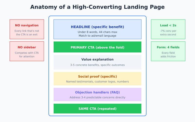
A landing page has one job: convert the specific traffic you send to it into one specific action. That’s it. The moment it tries to also educate, build brand awareness, or offer navigation to other products, conversion rate drops. The constraint is the feature. The same single-minded discipline applies after the click, too — a cluttered or distrust-inducing checkout is one of the biggest reasons shoppers abandon their carts even after a landing page does its job.
In my experience, high-converting landing pages share five structural traits: one audience, one offer, one CTA, no distractions, and fast loading. Everything else — hero images, colors, testimonials layout — is an optimization on top of those fundamentals. Skip the fundamentals and the optimizations compound on quicksand.
The Nine Practices That Actually Move Conversions
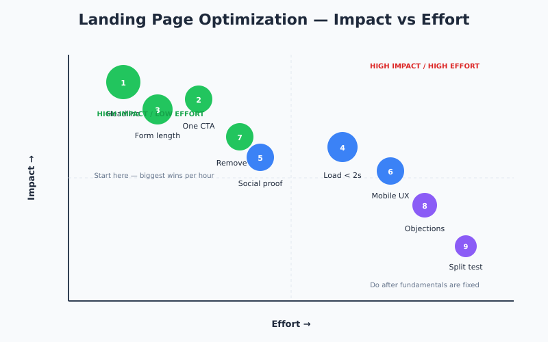
Ranked roughly by how much impact each one has for the effort involved.
1. Write a Specific Headline
The headline is 60-80% of the conversion outcome. Vague headlines — “Transform your business,” “The smartest way to grow” — perform worse than specific ones. “Cut ad waste 30% in 14 days” beats “Smarter advertising.” Always.
Best practice: under 8 words or 44 characters, state a concrete benefit, and match the language of the ad or email that sent the visitor. A mismatch between ad copy and headline can drop conversion rates 50%+ without any change to the rest of the page. The same logic applies to organic landing pages: use a SERP simulator to confirm that the title and description shown in Google match the headline above the fold — message-match disconnect at the SERP level kills CTR before the conversion test even starts.
2. Have One CTA, Repeated
Not one CTA once — one CTA repeated three times: above the fold, mid-page after value explanation, and near the end. Multiple different CTAs (“Start free trial” and “Schedule demo” and “Download PDF”) split attention and cut conversion significantly.
If you genuinely need two conversion paths — say, product-led trial vs sales-assisted demo — run them on separate landing pages. One purpose per URL. For context on testing CTA variants, see how to run A/B tests without fooling yourself.
3. Cut Form Fields to the Bone
If your form has five fields, removing two non-essential ones is often the single biggest conversion win available. A four-field form converts 40-60% better than an eight-field form. Every field is friction.
The rule: only ask for what you need to deliver the next step. You can enrich and qualify later — via email follow-up, sales call, or CRM data enrichment tools. Form abandonment is real and usually happens silently.
4. Load in Under 2 Seconds
Every 100ms over 2 seconds compounds. Conversion drops roughly 7% per additional second of load time. The fixes are unglamorous but well-known:
- Compress images aggressively (WebP or AVIF)
- Defer non-critical scripts (especially chat widgets and heatmap tools)
- Use a CDN
- Eliminate unused CSS and JavaScript
Monitor with Core Web Vitals — LCP, INP, and CLS all correlate directly with conversion rate on landing pages.
5. Include Specific Social Proof
“Trusted by thousands” converts worse than “Used by 4,200 agencies.” Specific numbers work. Logos of recognizable customers work. Testimonials with a name, photo, company, and title work. Anonymous testimonials do nothing.
However, don’t stack social proof everywhere — it dilutes. Two well-placed testimonials outperform six scattered ones. Put the strongest proof near the CTA and the trust-focused proof near objections (security, pricing, implementation concerns).
6. Match Mobile UX Standards
Desktop converts at 4.8-5%, mobile at 2.5-2.9%. Closing that gap is one of the highest-impact optimizations available. Specifics:
- Buttons at least 48×48 pixels with 8px spacing
- Forms with appropriate input types (
type="email",type="tel") to trigger the right mobile keyboard - No pop-ups that are hard to dismiss — Google penalizes intrusive interstitials
- Sticky CTA visible without scrolling
7. Remove Navigation
A landing page isn’t your homepage. Strip the top navigation, footer links, and sidebar. Every link that isn’t the CTA is an exit route. Some tests show 10-30% conversion lift from removing nav alone — essentially free.
Exception: keep a small logo that links to the homepage so users who arrived by mistake can escape gracefully. But drop the full menu.
8. Address Objections Directly
Every landing page has three or four predictable objections. “Is this too expensive?” “Will it work for my situation?” “How long will this take?” “Can I trust this company?” A page that addresses them explicitly converts better than one that leaves them as friction.
Concretely: FAQs below the fold, comparison tables when pricing is unclear, guarantees when risk is the blocker, and implementation examples when time is the concern.
9. Split-Test, Don’t Redesign
The biggest mistake I see teams make is running a “conversion optimization sprint” that redesigns the whole page and reports a lift. You have no idea which change caused the lift, and often the lift vanishes at scale because it was noise.
Instead, run sequential A/B tests on one element at a time — headline first (biggest impact), then CTA copy, then form length, then hero image. This takes longer but produces actually valid learnings.
What Doesn’t Matter as Much as People Think
These get talked about constantly in CRO content. In my experience, they move conversion much less than claimed:
- Button color. Contrast matters. Specific color rarely does. “Green converts more than red” is a myth.
- Hero image style. The hero image should not distract from the headline. Stock photos, custom illustrations, product screenshots — all can work.
- Exit-intent pop-ups. Often annoying, rarely produce net positive conversions. Test carefully.
- Long-form vs short-form. Depends on the offer. Free trials convert better on short pages; high-ticket purchases need long-form explanation.
- Live chat. For most B2B it’s a conversion positive. For simple consumer products it’s usually a distraction.
Specifically, don’t spend cycles optimizing these before you’ve nailed headline, CTA, form length, and load time. The common pattern I see is teams spending weeks on hero illustrations while the form still has eight fields.
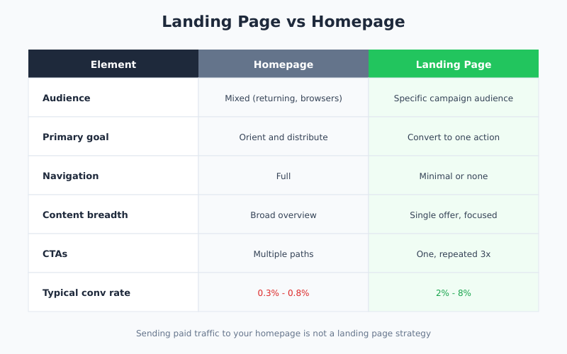
Landing Page vs Homepage: Know the Difference
| Element | Homepage | Landing Page |
|---|---|---|
| Audience | Mixed (returning users, browsers) | Specific campaign audience |
| Goal | Orient and distribute | Convert to one action |
| Navigation | Full | Minimal or none |
| Content | Broad overview | Single offer, focused |
| CTAs | Multiple paths | One, repeated |
| Traffic source | Mixed | One campaign or channel |
If your “landing page” is just the homepage, you’re not running a landing page strategy. You’re sending paid traffic to your homepage, which typically converts at 0.3-0.8% versus 2-8% for proper landing pages. This connects to how you measure the difference — see sales funnel analysis for methodology.
Testing Approach That Actually Works
Landing page optimization only works if you measure correctly. Three rules from running dozens of tests:
- Test one thing at a time. Multivariate tests need 10x the traffic to reach significance. Sequential A/B tests are slower calendar-wise but cheaper data-wise.
- Run tests to significance. 95% statistical significance isn’t arbitrary. Stopping tests when they “look like they’re winning” produces false positives about 30% of the time.
- Measure the right goal. If your landing page feeds a sales team, measure qualified leads, not form submits. The cheapest form submit optimization often reduces qualified lead count.
For deeper methodology on making tests statistically valid, see the Shopify conversion funnel breakdown and CXL’s A/B testing statistics guide.
Tools You Actually Need
The tool stack for landing page optimization has consolidated. In practice, most teams need:
- Page builder: Unbounce, Instapage, Leadpages, or Webflow. Pick one; switching costs are high.
- A/B testing: Optimizely, VWO, or Google Optimize’s successor (Convert.com is a reasonable free/low-cost alternative).
- Session recording: Hotjar, FullStory, or Microsoft Clarity (free) to see where users hesitate.
- Analytics: GA4 or a cookieless alternative for conversion tracking.
- Form analytics: Zuko or built-in form analytics in your page builder to identify field-level drop-off.
Session recording is the most underused tool in this list. Watching 10 real users hesitate on your page teaches more than a month of analytics reports.
Bottom Line
Landing page best practices are not secrets. They’re well-documented: specific headline, one CTA repeated, minimal form, fast load, relevant social proof, no navigation, explicit objection handling. The teams that follow them consistently outconvert the teams that optimize button colors and hero illustrations by a factor of two or more.
Therefore, start with the fundamentals before anything else. Audit your current landing pages against the nine practices above. Fix headline and form length first — they’re the highest-impact, lowest-effort changes. Then test sequentially, measure the right goal, and be honest about which metrics are moving. Most “conversion optimization” projects fail because they skip step one and jump straight to creative testing on top of broken fundamentals.