A sales funnel analysis finds the exact step where prospects give up — not where they arrive, not where they convert, but where the leak actually lives. Most teams skip this step and try to “improve conversions” by tweaking whatever feels broken. That rarely works, because the drop-off you can see is almost never the drop-off that matters.
In this guide, I’ll walk through how to build a funnel that’s accurate enough to trust, how to read drop-off percentages without fooling yourself, and which fixes actually move the needle. I’ve run this analysis on e-commerce sites, SaaS products, and lead-gen funnels — the mechanics are the same, only the stage names change.
What Is Sales Funnel Analysis?
A sales funnel analysis is the process of tracking how users progress through a defined sequence of steps toward a conversion, then calculating the percentage that drop off between each pair of steps. The output is a stage-by-stage conversion rate and a ranked list of “leaks” — the transitions where you lose the most users.
Concretely, you’re answering three questions: (1) how many people enter each stage, (2) what percentage move to the next stage, and (3) which stage-to-stage transition has the worst retention. The third question is where optimization money should go, not the first. How much you can justify spending on each fix ultimately depends on what a converted customer is worth over their lifetime, not just the value of one order.
Funnel vs Conversion Rate
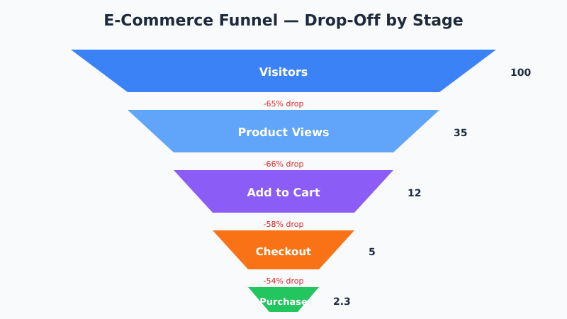
A single conversion rate — say, 2.3% visitor-to-purchase — is a headline metric. It tells you nothing about where the problem is. A funnel breaks that 2.3% into a chain:
- 100 visitors →
- 35 product views (65% drop) →
- 12 adds-to-cart (66% drop) →
- 5 initiate checkout (58% drop) →
- 2.3 purchases (54% drop)
Now you know the biggest percentage-point loss is at the top — but the biggest absolute count loss is also at the top, so you have a strategic choice between fixing the visitor-to-product-view drop (high volume) or the checkout-to-purchase drop (high intent). For benchmarks on what conversion rates look like by industry, I covered this in conversion rate benchmarks by industry.
The Four Common Funnel Shapes
Most sites fit one of four funnel archetypes. Match yours before you start measuring — the stage names determine everything downstream.
| Funnel Type | Stages | Typical End-to-End Rate |
|---|---|---|
| E-commerce | Visit → Product view → Add to cart → Checkout → Purchase | 1-3% |
| B2B lead-gen | Visit → Content view → Lead magnet → MQL → SQL → Close | 0.1-1% |
| SaaS trial | Visit → Signup → Activated → Paid conversion | 0.5-2% |
| Subscription content | Visit → Article view → Email signup → Paid subscription | 0.3-1.5% |
However, these are averages. For your site, baseline against your last 90 days — not the generic industry number. External benchmarks are useful as sanity checks only.
How to Build a Funnel That’s Accurate
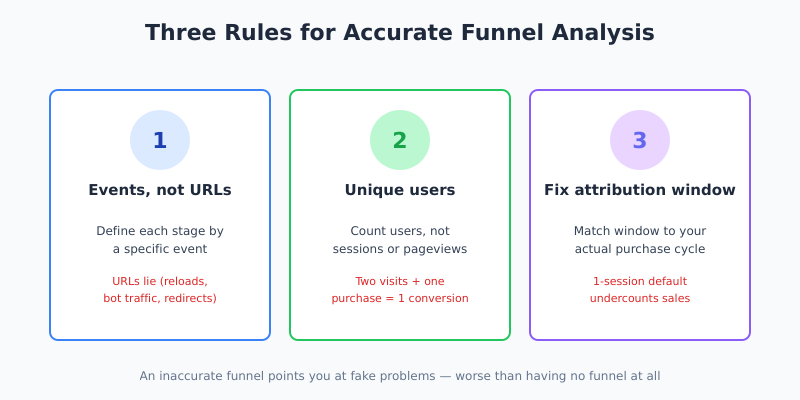
An inaccurate funnel is worse than no funnel, because it points you at fake problems. Three rules keep your numbers honest:
- Define each stage by an event, not a URL. URLs lie. A user who reloads the checkout page three times generates three URL visits but one real “reached checkout” event. Use GA4 events or a dedicated product analytics tool.
- Count unique users per stage, not sessions or pageviews. A user who visits twice and converts once isn’t two conversions; they’re one.
- Fix the attribution window. If a user adds to cart today and buys in 7 days, your funnel needs to know that’s still a conversion. Default 1-session windows undercount.
The biggest accuracy trap I see is counting the same user at multiple stages within a single session. If your analytics treats “added to cart” and “removed from cart, re-added” as two add-to-cart events, your cart-to-checkout rate will look inflated. This interacts heavily with how your GA4 sessions are configured, so verify session boundaries before trusting funnel numbers.
Reading Drop-Off Percentages Correctly
A 65% drop at the top of the funnel is not necessarily bad, and a 5% drop at the bottom is not necessarily good. Context is everything. Here’s how I read each stage:
- Visit → Product view: 50-70% drop is normal. Traffic quality matters more than on-page optimization here.
- Product view → Add to cart: 85-95% drop is normal. This is where intent is filtered. A drop above 97% means the page isn’t doing its job.
- Cart → Checkout initiate: 30-50% drop is expected (cart abandonment). Free shipping thresholds and unexpected costs are the usual culprits.
- Checkout initiate → Purchase: 20-40% drop is normal. Form friction, payment options, and trust signals dominate here.
Specifically, compare each stage to its own baseline over time, not to the next stage. A stage getting worse is a regression signal; a stage that’s always been bad might just be how your business works. For context on designing experiments to validate fixes, see how to run A/B tests without fooling yourself.
Segmenting the Funnel
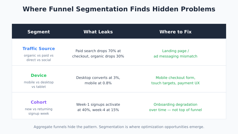
Aggregate funnels hide the real pattern. Segmentation is where optimization opportunities actually emerge. The three cuts that pay off most often:
By Traffic Source
Organic visitors convert differently than paid. Direct visitors (often returning) convert differently than first-time social clicks. If your paid search funnel has a 70% drop at checkout but organic only has 30%, you have a landing page / ad messaging mismatch, not a checkout problem.
By Device
Mobile funnels almost always leak harder at checkout. If your desktop funnel converts at 3% and mobile at 0.8%, you know exactly where the engineering time goes — and it’s not the homepage. The checkout step deserves its own deep dive, because the reasons people bail at payment are specific and fixable; I broke them down in why 70% of shoppers abandon checkout and how to fix it.
By Cohort
New vs returning users move through funnels differently. A SaaS funnel where week-1 signups activate at 40% but week-4 signups activate at 15% points to an onboarding degradation over time — not a top-of-funnel problem at all.
Fixing Drop-Offs: What Actually Works
Once you’ve identified the biggest leak, the fixes that move the needle are almost always one of these five. In priority order based on impact per hour of work:
- Remove friction at the highest-intent stage. Fewer checkout fields. Remove the account requirement. Enable guest checkout. This is the cheapest win.
- Add trust signals where money is involved. Reviews on product pages, security badges in checkout, clear return policy. Cheap to test, consistent impact.
- Eliminate surprise costs. Shipping appearing for the first time at checkout is the single biggest cause of cart abandonment. Show it on the cart page or commit to free shipping.
- Reduce page load time at the stage with the worst drop. Every 100ms over 2 seconds compounds. This connects directly to Core Web Vitals.
- Match the landing page to the ad. If your paid traffic funnel underperforms, the issue is usually a messaging mismatch, not the landing page itself.
However, avoid the trap of running a design change and calling it a fix. Every change needs to be validated with an A/B test or at minimum a before/after cohort comparison. Redesigns that “looked better” have ended more funnels than they’ve saved.
Tools for Funnel Analysis
The tool you use matters less than the consistency of your event definitions. That said, here’s what each class of tool is good at:
| Tool Class | Strengths | Limitations |
|---|---|---|
| GA4 (free) | Built-in funnel exploration, decent free tier | Sampled data above thresholds; limited segmentation flexibility |
| Product analytics (Amplitude, Mixpanel, PostHog) | Event-based, flexible funnel definitions, cohort analysis | Setup effort; cost scales with events |
| Session recording (Hotjar, FullStory) | See the actual user behavior at drop-off stages | Qualitative only; doesn’t show stage totals |
| Warehouse + BI (BigQuery + Looker) | Full control, no sampling, custom joins | Engineering lift; delayed data |
In practice, most teams need two tools: one quantitative funnel tool (GA4 or a product analytics platform) and one qualitative tool (session recording) to explain why the drops are happening. The Amplitude write-up on sales funnel analysis has a solid walkthrough of the quantitative side, and the Shopify conversion funnel guide covers e-commerce-specific edge cases.
Common Funnel Analysis Mistakes
Five patterns I see repeatedly in audits — each one produces wrong conclusions from correct-looking data:
- Comparing absolute numbers to relative rates. A stage with 5,000 users dropping 30% has more room for improvement than a stage with 50 users dropping 80%.
- Ignoring time-to-convert. If your median purchase takes 3 days but your funnel window is 1 session, you’re systematically undercounting conversions.
- Treating all users equally. A user who added 5 items and bounced is not the same as one who abandoned a single-item cart. Segment by intent.
- Not checking for attribution inflation. If your product view event fires on every carousel scroll, your view count is wrong by 3-5x.
- Optimizing the wrong stage. The stage with the biggest percentage drop isn’t always the one with the biggest revenue upside. Always weight by downstream value.
Ultimately, funnel analysis is a measurement discipline first and an optimization tool second. If your events are dirty, no amount of dashboard polish will help.
Bottom Line
A sales funnel analysis takes a headline conversion rate and breaks it into a chain of transitions so you can see where customers actually leave. The discipline is simple: define stages by events, count unique users, fix your attribution window, and segment before you conclude. The leak you find at the end of that process is almost never the one you’d have guessed at the start.
Therefore, run funnel analysis quarterly and after any significant change to the product, checkout, or traffic mix. Track each stage’s conversion rate as a separate metric over time. When a stage-level rate degrades, that’s your early warning — long before the topline conversion number moves enough to notice.